In the fast-paced world of digital marketing, solo ads have become a popular way to drive targeted traffic to your website. However, driving traffic is only one part of the equation. The success of your solo ad campaign depends largely on what happens once a visitor lands on your page. This is where the effectiveness of your landing page comes into play.
A well-optimized, high-converting landing page can turn visitors into leads or paying customers, maximizing your return on investment (ROI). In this post, we will walk through the top strategies to build a landing page that converts, specifically tailored to the traffic generated by solo ads.
Define a Clear, Single Objective
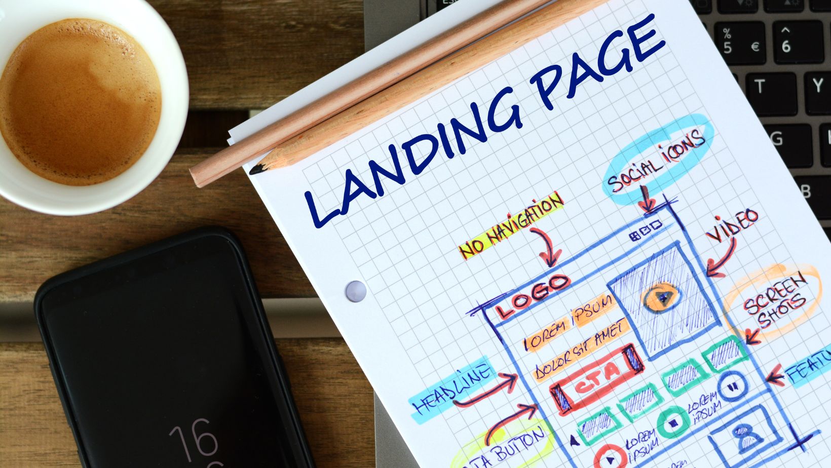
The first rule of building a high-converting landing page is to define a single objective and keep the focus tight. Whether you want visitors to sign up for a newsletter, download a free ebook, or purchase a product, your landing page should guide them toward that one action.
Solo ad traffic comes from targeted email lists, which means users are already somewhat interested in your niche. However, they may not be familiar with your brand or offer. A landing page with a cluttered design, multiple calls-to-action, or irrelevant links will only confuse visitors and lower your conversion rate.
Clearly outline the purpose of your landing page from the start and structure all content, buttons, and visuals around this primary goal.
Create a Compelling Headline and Subheadline
The headline is the first thing visitors will notice on your landing page, so it needs to capture their attention immediately. Your headline should address the visitor’s problem and offer a clear solution. This is especially important when working with solo ads, as the user is likely clicking over from an email that promised something specific.
For example, if your solo ad email promotes a free lead magnet, your landing page headline might read, “Get Your Free Guide to Generating High-Quality Leads Today!” Your headline should connect with the message in the solo ad and deliver on the promise made in the email.
A well-written subheadline can support the main headline by providing further clarification or a brief value proposition. Together, they should give the visitor a reason to stay on the page and explore your offer.
Use Concise, Engaging Copy
When it comes to solo ads, simplicity is key. Your landing page copy needs to be concise, engaging, and easy to read. Visitors from solo ads are often scanning for information quickly, so avoid long paragraphs or complex language that may cause them to lose interest.

Focus on the benefits of your offer rather than just the features. Highlight how your product, service, or freebie will solve their problem or meet their needs. Break up your content with short paragraphs, bullet points, and headings to make it more digestible.
Additionally, using persuasive language that appeals to emotions can increase your conversion rate. Phrases like “exclusive offer,” “limited time,” or “proven to work” can create a sense of urgency and push the visitor toward action.
Strong Call-to-Action (CTA)
Every successful landing page has a strong and clear call-to-action (CTA). Your CTA should stand out visually and communicate exactly what you want the visitor to do. Whether it’s downloading an ebook, signing up for a free trial, or purchasing a product, your CTA should use action-oriented language.
For example, instead of a generic CTA like “Submit,” use something more compelling such as “Get Your Free Guide Now” or “Start Your Free Trial Today.” This reminds the visitor of the value they’re getting by clicking the button.
Mobile-Friendly Design
A mobile-optimized landing page is crucial for solo ads. More and more people are accessing emails and clicking on ads from their smartphones. If your landing page is difficult to navigate on mobile, you’re likely to lose a significant number of potential conversions.
Make sure your landing page uses responsive design, meaning it automatically adjusts to fit any screen size. Test your landing page on various devices to ensure that the layout, images, and buttons are all displayed correctly. A mobile-friendly page ensures that your visitors can easily take the desired action, regardless of the device they are using.
Looking for Solo Ads Traffic?
If you’re actively looking for solo ads, it’s important to create landing pages that cater to this specific type of traffic. Solo ads send visitors who are already somewhat familiar with the niche you’re in, so it’s essential to meet their expectations when they land on your page.
This means designing a streamlined, user-friendly landing page that makes it easy for them to take the next step. Whether that’s opting into an email list or purchasing a product, the key is creating a frictionless experience that aligns with what they were promised in the email.
Visuals and Design Elements
While content is king, visuals play a significant role in creating a high-converting landing page. Use images, videos, or graphics that support your message and engage the visitor. For instance, if you’re offering a free ebook, include an image of the book cover or a related visual to give visitors a tangible idea of what they’re getting.

However, avoid overwhelming your page with too many images or large files that could slow down your page load time. A slow-loading landing page can result in higher bounce rates, which means visitors leave before they even get a chance to see your offer.
A clean, simple design with relevant visuals can keep your audience focused on your CTA and improve the overall user experience.
Trust Indicators and Social Proof
When visitors land on your page, especially from solo ads, they may not be familiar with your brand. Trust indicators like testimonials, reviews, or even trust badges can give visitors the confidence they need to take action.
Social proof is one of the most effective ways to build credibility. Including quotes from happy customers, reviews from trusted sources, or statistics about the number of people who have benefited from your offer can reassure potential customers that they’re making a good decision.
A/B Testing and Optimization
Even the most well-designed landing pages can benefit from continuous testing and optimization. Use A/B testing to try different versions of your landing page to see what works best. You can test elements such as your headline, CTA, images, or even the color of your buttons.
Data-driven decisions can help you refine your landing page over time, leading to higher conversion rates. Tools like Google Optimize or Optimizely can help you easily implement A/B tests and track performance.
By following these strategies, you can create a landing page that not only grabs attention but also drives conversions from solo ads traffic. It’s important to remember that a successful solo ad campaign doesn’t stop at generating clicks. You must ensure that your landing page is optimized for the audience you’re targeting to see meaningful results.
